Actually Text Kerning is not a good title for this article because in it I will cover all the different typographical adjustments you can make in Inkscape. Shown below is a list of what we will cover.
| leading | space between lines |
| tracking | space between all letters |
| kerning | space between two letters |
| vertical shift | vertical offset of part of line |
| character rotation | rotation one character |
The easiest way to make typographical adjustments in Inkscape is to use the controls on the Tool Controls bar.
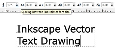
Shown above is text without any typographical adjustments. There is a huge debate online as what the definition of "font size" is. Most people think it is the height of a character. But you can clearly see above that the space between lines is not 1.2 times the height of a character.
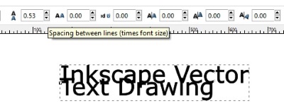
Since we are mostly concerned about the graphical look of our work, we can choose to ignore whatever actual dimensions Inkscape provides and just use the up-down arrow buttons to visually set the spacing between lines. Shown above, I have set the spacing between lines so that the lines overlap.
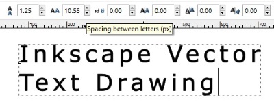
The second typographical control allows you to adjust the spacing between characters. This is called tracking. Shown above, I have increased the spacing between characters.
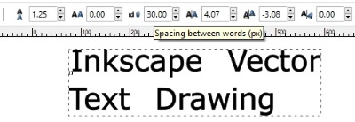
The third typographical control allows you to adjust the spacing between words. Shown above, I have increased the spacing between words.
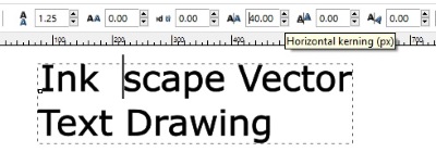
The fourth typographical control allows you to adjust the spacing between two characters. This is called kerning. It adjusts the spacing at the point of the insertion point. Shown above, I have increased the spacing between the characters k and s in the word "Inkscape".
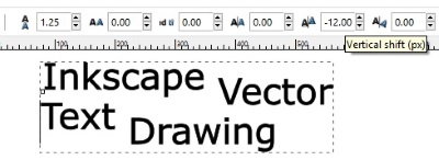
The fifth typographical control allows you to adjust the vertical shift. It seems to adjust the vertcial shift of the entire line to the right of the insertion point. Shown above, I have adjusted the vertical positions of various words in the paragraph.

The sixth typographical control allows you to adjust the character rotation. It adjusts the rotation of the character at the point of the insertion point. Shown above, I have rotated the "V" in the word "Vector".
As you can see, although Inkscape might be considered a vector drawing application, it is also a powerful typographical design program.
More Graphics Design Tips:
• Inscape Text in a Shape
• Inkscape - How to Join Two Segments at Endnodes
• Export Inkscape Drawing as an Image
• What is the Pantone Color System?
• SVG Example Code to Scale Elements
• Free Animated GIF Maker
• Getting Started with Krita
• SVG Code for Outlined Letters Text
• What is Blender? The Software's Origins and Evolution
• Inkscape Basics

